Client
Aéroport de Paris

Overview
The Paris Airport self-service kiosk redesign aimed to create a more intuitive and efficient user experience. By analyzing user pain points and optimizing the interface, the project focused on improving accessibility, simplifying interactions, and ensuring seamless navigation for both frequent and first-time travelers. The goal was to enhance efficiency while maintaining a sleek and modern aesthetic aligned with the airport’s branding.
Client
Aéroport de Paris
Service
UI Design
UX Design
Workshop
Duration
1 Week
The Challenge
The existing self-service kiosks at Paris Airport presented usability challenges, including complex navigation, unclear visual hierarchy, and accessibility issues. The interface needed to cater to a diverse audience, including international travelers with varying levels of digital literacy, while maintaining efficiency and clarity in high-traffic environments.
The design approach
To enhance user experience and accessibility, we implemented a user-centric redesign focusing on clarity, efficiency, and flexibility. The homepage was restructured to better orient users by grouping key options into clear sections, improving visual hierarchy with color distinctions, and adding section titles (e.g., “Consult Flights,” “Find Your Way,” “Explore”) for intuitive navigation. The departing flights search was refined to offer a smoother flow, allowing users to browse flights before initiating a search, with an improved placeholder and a help button for guidance. The map/itinerary screen was reorganized to highlight essential flight details while introducing a new feature that lets users add stops to their journey, such as shops or restaurants, making the experience more flexible. Additionally, a kiosk-to-mobile transition was designed for better visibility, enabling users to seamlessly transfer their itinerary from the kiosk to the mobile app, allowing users to follow their route from their initial point to the check-in gate, ensuring a smooth and stress-free journey.
PORTFOLIO
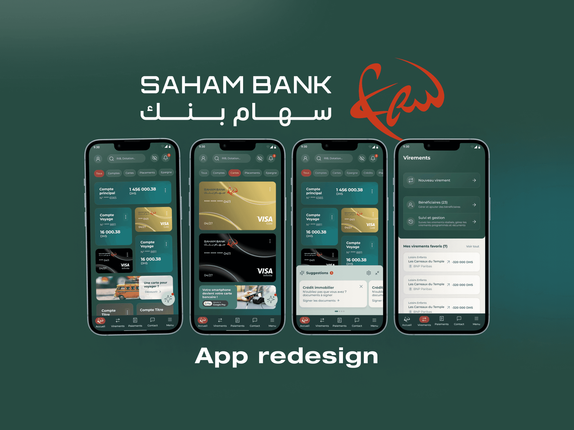
Saham Bank Morocco App
Saham Bank Morocco App
Saham Bank Morocco App
Product Design
Design System
Workshops
UX Design
UI Design
Orange eBoutique Redesign
Orange eBoutique Redesign
Orange eBoutique Redesign
UI Design
UX Design
Wireframing
UI Kit


