Client
Orange Maroc

Overview
I led the UX/UI redesign of the Orange Maroc e-boutique, a project driven by the need to overcome technical limitations and modernize the user experience. The initiative was a response to an outdated platform architecture that was hindering the creation of high-performance interfaces, particularly for mobile users who represent 90% of the site's traffic. My role was to completely overhaul the customer journey, from initial product discovery to final checkout, with a focus on creating a seamless, intuitive, and conversion-optimized experience.
Client
Orange Maroc
Industry
Telecom
Service
UI Design
UX Design
Wireframing
Content
Duration
1 month


The Challenge
Orange Maroc's e-boutique was struggling with a high abandonment rate, especially in the mobile plan purchase funnels. A customer study revealed significant friction points, including a confusing shopping process, unclear error messages, and a lack of transparency regarding costs. The data showed a drastic drop-off in the "new number" funnel, where only 6.84% of users completed the delivery stage, highlighting a critical need to rebuild customer trust and simplify the purchasing journey. Key areas for improvement included clarifying complex offers, providing clear error messages, streamlining the purchase tunnel, and ensuring early transparency on additional charges.


The design approach
To address the identified issues, I approached the redesign of the e-boutique as a series of distinct user journeys (buying a smartphone, selecting a mobile plan, completing a purchase), each tackled through a consistent design process. For each journey, I started with lightweight discovery research, including competitor analysis and a review of e-commerce and telecom best practices, to identify common patterns, usability standards, and opportunities for improvement. Based on these insights, I designed wireframes to structure the flows and interactions, which were reviewed and validated with the client before moving into high-fidelity UI design. Shopping flow I reworked the smartphone and devices flow by introducing enhanced product cards, sticky filters, and a mobile-first optimized layout. On the product page, I implemented a split-column design and a sticky “Add to Cart” CTA on mobile, along with cross-selling modules and reassurance elements. To address a key pain point, I simplified the out-of-stock experience by allowing users to sign up for restock alerts without requiring account creation. For mobile plan selection, I introduced a visually simplified layout with distinct color cues and clearly organized packages based on price range and usage, making it easier for users to compare options and understand the purchase flow. Cart & checkout I optimized the cart page with a clear, right-aligned order summary and improved cost transparency through a highlighted pricing recap. The promo code interaction was made more fluid, and the Checkout call-to-action received a visual hierarchy upgrade to encourage completion. Error handling & transparency Across all journeys, I implemented a consistent approach to error messaging, focusing on clarity and guidance to help users recover quickly. Additional costs, such as delivery fees, were surfaced as early as possible in the flow to reduce friction and build trust.
The Result
By creating a more intuitive and fluid mobile-first experience, the redesigned user journeys addressed key usability and friction issues within the purchasing funnels. The clearer and more transparent process, combined with an optimized layout, aimed to rebuild user confidence and reduce abandonment across critical steps. According to client-provided post-launch data, these improvements were followed by a conversion rate increase from 0.8% to just over 2% after the redesigned e-boutique went live. While multiple factors may have contributed to this evolution, the UX/UI redesign focused on simplifying decision-making and reducing friction throughout the purchase flow.
PORTFOLIO
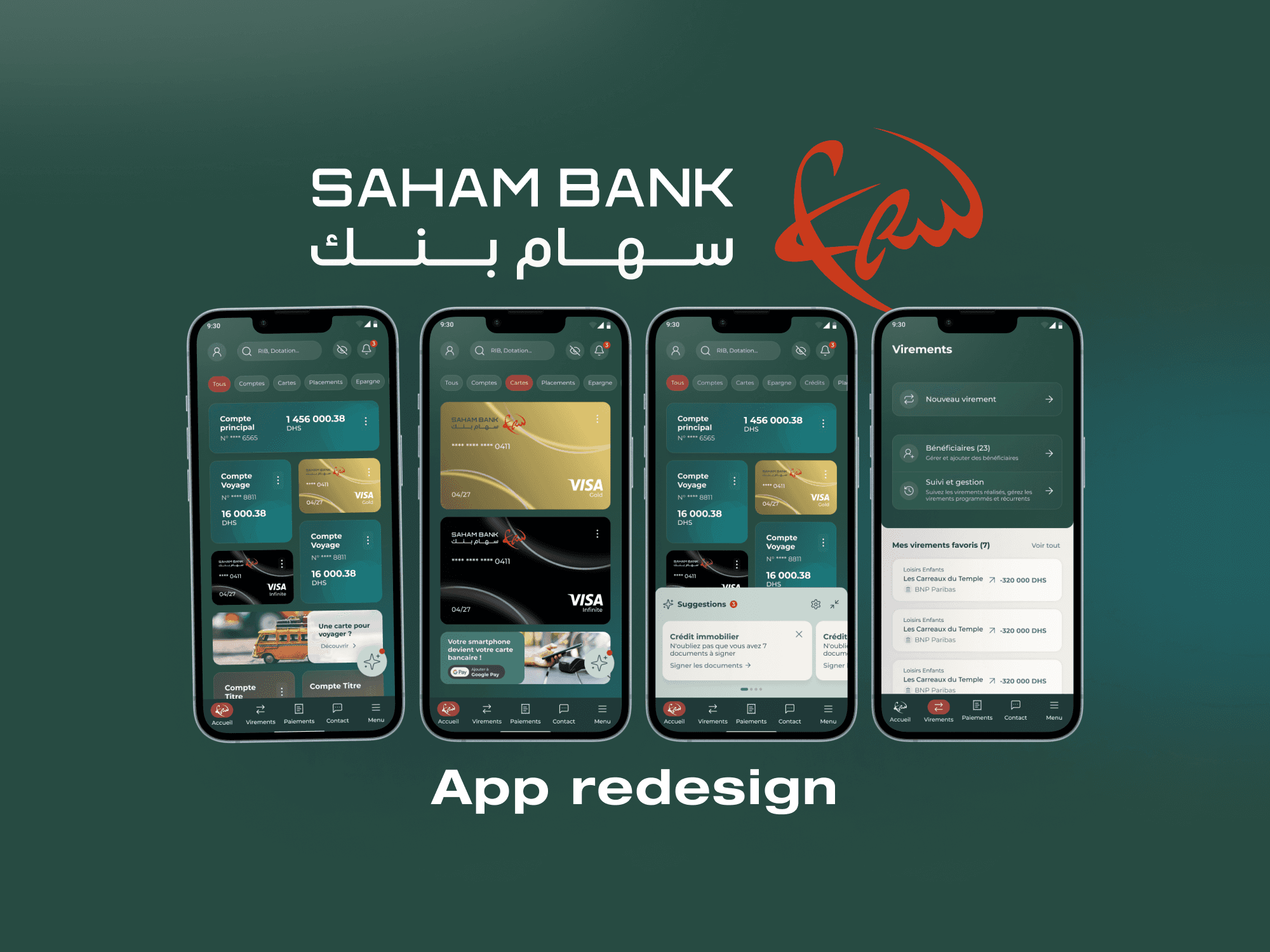
Saham Bank Morocco App
Saham Bank Morocco App
Saham Bank Morocco App
Product Design
Design System
Workshops
UX Design
UI Design

OUIGO France App
OUIGO France App
OUIGO France App
UI Design
UX Design